Oxygen FAQ
Up to date, expert answers to frequently asked questions (FAQ) about oxygen supply systems, respiratory care and pulse oximetry written by OCC & collaborators.
Causes of inaccuracies
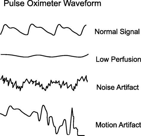
What does a normal pulse oximeter photoplethysmograph look like?
A pulse oximeter photoplethysmograph (commonly referred to as a ‘pleth’) is a graphical display of the pulse oximeter signal over time. Its appearance can vary widely under different clinical scenarios. In healthy patients, the graph should appear as asymmetric humps similar in appearance to an arterial pressure waveform though usually with less level of detail (i.e. the dicrotic notch may not be visible). The waveform should appear at intervals that match the heart rate and regularity.
Patient motion, tremor and poor perfusion are common factors that affect the pleth. The pleth is an extremely useful feature to help clinicians quickly determine the quality of the oximeter signal. Of note, in the face of a low signal (or low perfusion) some oximeters may auto adjust the scale of the display (y axis) to increase the visual amplitude of the pleth. This can be misleading to clinicians who must also pay attention to signal quality indicators when available.
References: Jubran, Crit Care 2015
Keywords: pleth, waveform, PPG